ShopDreamUp AI ArtDreamUp

Deviation Actions


Description
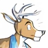
I decided I was tired of looking at my old HeadJack shirt so I whipped up a new design based generally off racing decals. Available in red and green, and you can find the shirts/hoodies/stickers here, if you so desire:
[link]
----------
Shirts have been hidden until I figure out what, if anything, I'm doing for screen-printing. It should be cheaper for you than RedBubble, and higher quality. I'll be taking pre-orders soon. Sorry for the waffling on this!
Please, let me know which color scheme you'd prefer on a shirt. I doubt I'll be able to run both designs, unfortunately.
Image size
778x379px 221.45 KB
© 2012 - 2024 CaseyLaLonde
Comments2
Join the community to add your comment. Already a deviant? Log In
I like the green, but if it had the dark backround and white border like the red one does.